Here is a scene that plays out thousands of times a day across every personal finance app in India.
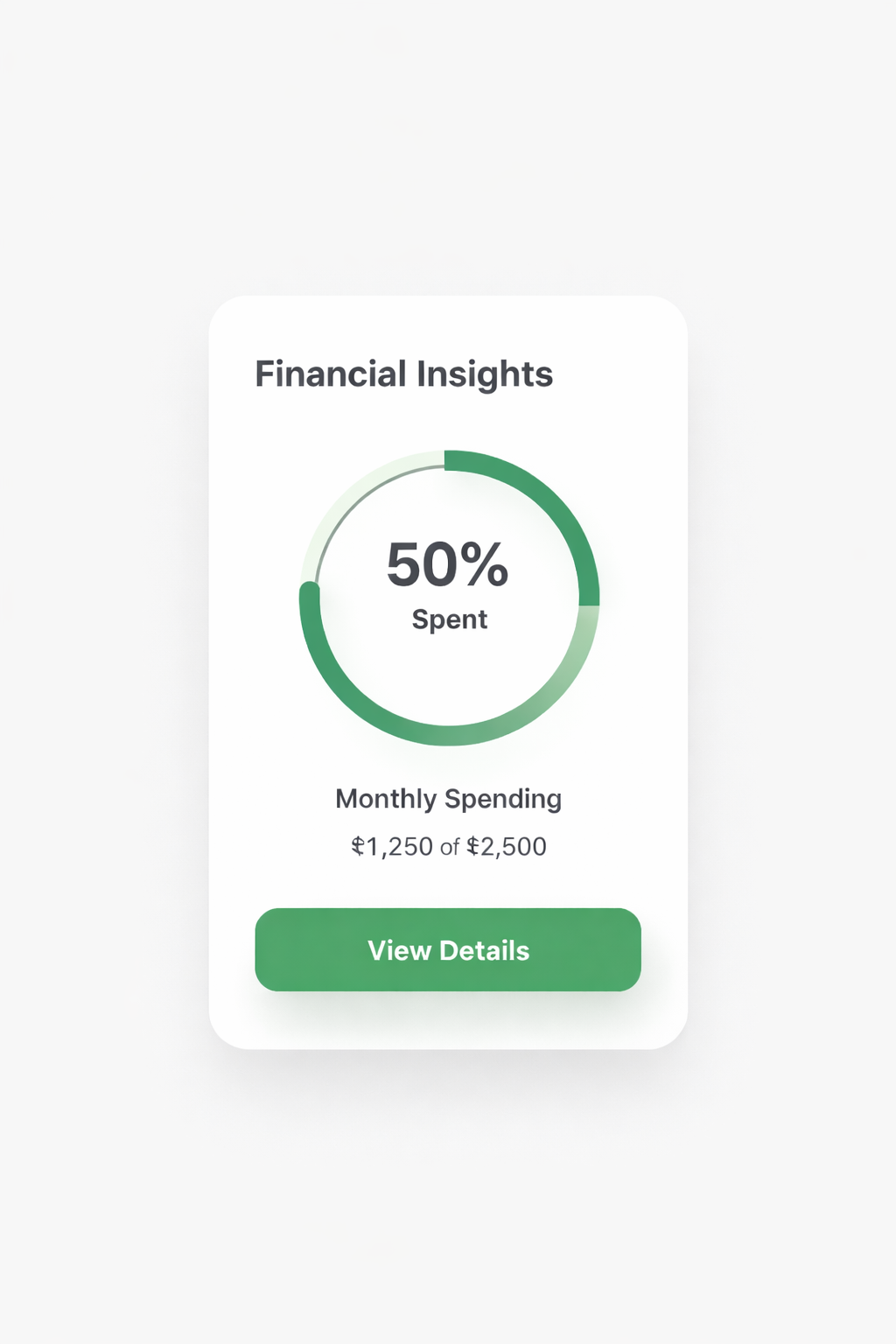
A user opens the app. They see a pie chart. Food: 34%. Shopping: 22%. Transfer: 18%. They look at it for a moment. They close the app.
Nothing changed.
They now know something they didn’t know before. But knowing is not the same as doing. And the gap between those two things is where most fintech products quietly fail their users.

The dashboard delusion
The personal finance app industry built dashboards for one primary reason: they are impressive to look at, fast to build, and easy to demo to investors.
A pie chart of spending categories looks like insight. A line graph of monthly expenses looks like progress. A net worth number looks like clarity. In a pitch deck, in a product walkthrough, in an App Store screenshot, they all signal sophistication.
What they don’t do is tell a 26-year-old earning ₹45,000 a month what to actually do differently.
This is not a design problem. It is a philosophy problem. Dashboards are built on the assumption that users lack information, and that giving them information will change their behaviour. If they could just see where their money is going, they’d make better decisions.
That assumption is wrong.
Our users already know they spend too much on food delivery. They know their subscriptions are adding up. They know they should be saving more. The information was never the missing piece. The missing piece is what to do about it, in their specific situation, right now.
8 minutes on a transactions page
When we looked at how first-time Finanjo users actually behave in the app, one number stood out.
The average first-time user spends 8 to 10 minutes on the transactions page.
Not the dashboard. Not the insights tab. The raw transactions page. A list of every debit and credit they’ve made, pulled from across all their linked accounts into one unified view.
At first, this looked like a product problem. Were they confused? Were they looking for something they couldn’t find?
Then we understood what was actually happening. Most of these users had never seen their complete financial picture in one place before. Their salary hits one bank. Their credit card sits in another. Their UPI spends are scattered across three apps. Nobody had ever shown them the full thing at once.
They weren’t confused. They were fascinated. They were doing what any person does when they finally see the complete truth about something they’ve been partially blind to: they read every line.
But after those 8 to 10 minutes, the app gave them nothing to do with what they saw. No recommended action. No next step. No answer to the question sitting in the back of their head: so what should I do now?
That’s the dashboard problem, made visible. Information delivered without momentum is just a more organised version of anxiety.
The difference between data and momentum
Data tells you what happened. Momentum tells you what to do next.
Every finance app in India is competing to give users better data. Cleaner categorisation. More accurate spending breakdowns. Better visualisations. Faster syncing. These are real improvements. They make the data more accurate.
They do not make the gap between seeing and doing any smaller.
Momentum looks different. Momentum is: you have ₹12,400 in your account, your rent goes out in 4 days, and after that you’ll have ₹5,200 left for the rest of the month. Here’s what that means for your weekend plans.
Momentum is: you’ve spent ₹6,800 on food delivery this month, which is 40% above your average. That’s ₹2,100 you could redirect. Here’s what ₹2,100 does if you put it in a liquid fund for 6 months.
Momentum is not just showing users that their emergency fund is low. It’s calculating the exact monthly amount they need to set aside, and giving them a button to start a recurring transfer right now, before they close the app and forget.
This is what we learned from 4,000+ queries to Jo. Users don’t come to Jo to see their data. They come because they need to decide something. Should I buy this? Can I afford that? What should I do with this money sitting idle? Every single one of those questions is a request for momentum, not information.
What Finanjo’s product philosophy responds to
When we built the daily insights feature, we made one deliberate decision: every insight had to point somewhere.
Not “you spent more on food this month.” That’s data.
“You spent ₹2,400 more on food this month than your 3-month average. Your savings rate is currently 12%. Here’s what redirecting half of that gap does to your savings by December.”
That’s an insight with a direction.
The same philosophy built our approach to idle money. Most apps will tell you that you have ₹40,000 sitting in a savings account earning 3.5% interest. They show you the number. They move on.
We show you the number, calculate what that money would earn in a liquid fund over 6 months, and give you the option to move it with one tap. The difference in return is quantified. The action is one step away. The gap between seeing and doing is as small as we can make it.
This is not a feature difference. It is a product orientation difference. We are not building a better mirror. We are building a system that tells you what to do after you’ve looked in the mirror.
Why this is the only defensible position
Every investor conversation eventually arrives at the same question: there are a lot of apps trying to do this. What makes Finanjo different?
The honest answer is not a feature list. It is a fundamentally different answer to the question: what is a personal finance app actually for?
If the answer is “to show users their financial data,” then the competition is everyone with a good design team and an Account Aggregator integration. That’s a race to the bottom. Clean UI, fast sync, pretty charts. Commoditised within two years.
If the answer is “to get users to take the right financial action at the right moment,” then the competition looks completely different. Because that requires knowing the user, knowing their context, knowing what they’re anxious about and what they’re capable of, and building a product that closes the gap between all of that and a single clear next step.
That is not something you can copy with a design sprint. It is built from thousands of conversations, from understanding what questions users actually ask when they trust the product enough to be honest, from a product philosophy that was oriented around action from day one.
The dashboard apps can add insights later. They can bolt on recommendations. They can hire a product manager to make the pie chart more actionable. But they will be retrofitting. We are building from the other direction.
The next decade
Indian fintech’s first decade was about access. Get people into the financial system. Make payments digital. Open bank accounts. That job is largely done.
The second decade is about decisions. Now that 400 million Indians have a UPI handle and a linked bank account, the question is: what do they do with the money that flows through it?
The apps that answer that question well will not be the ones with the most data points. They will be the ones that understood early that data without direction is just noise, and that the real product is not the dashboard.
The real product is what happens after the user sees the dashboard and asks: so what should I do now?
We built Jo to answer that question. We built daily insights to answer that question. We built our investment nudges to answer that question.
Every product decision at Finanjo starts from the same place: not what can we show the user, but what should the user do next, and how do we make that as easy as possible.
That is the only version of this product worth building.
Here is a scene that plays out thousands of times a day across every personal finance app in India.
A user opens the app. They see a pie chart. Food: 34%. Shopping: 22%. Transfer: 18%. They look at it for a moment. They close the app.
Nothing changed.
They now know something they didn’t know before. But knowing is not the same as doing. And the gap between those two things is where most fintech products quietly fail their users.
The dashboard delusion
The personal finance app industry built dashboards for one primary reason: they are impressive to look at, fast to build, and easy to demo to investors.
A pie chart of spending categories looks like insight. A line graph of monthly expenses looks like progress. A net worth number looks like clarity. In a pitch deck, in a product walkthrough, in an App Store screenshot, they all signal sophistication.
What they don’t do is tell a 26-year-old earning ₹45,000 a month what to actually do differently.
This is not a design problem. It is a philosophy problem. Dashboards are built on the assumption that users lack information, and that giving them information will change their behaviour. If they could just see where their money is going, they’d make better decisions.
That assumption is wrong.
Our users already know they spend too much on food delivery. They know their subscriptions are adding up. They know they should be saving more. The information was never the missing piece. The missing piece is what to do about it, in their specific situation, right now.
8 minutes on a transactions page
When we looked at how first-time Finanjo users actually behave in the app, one number stood out.
The average first-time user spends 8 to 10 minutes on the transactions page.
Not the dashboard. Not the insights tab. The raw transactions page. A list of every debit and credit they’ve made, pulled from across all their linked accounts into one unified view.
At first, this looked like a product problem. Were they confused? Were they looking for something they couldn’t find?
Then we understood what was actually happening. Most of these users had never seen their complete financial picture in one place before. Their salary hits one bank. Their credit card sits in another. Their UPI spends are scattered across three apps. Nobody had ever shown them the full thing at once.
They weren’t confused. They were fascinated. They were doing what any person does when they finally see the complete truth about something they’ve been partially blind to: they read every line.
But after those 8 to 10 minutes, the app gave them nothing to do with what they saw. No recommended action. No next step. No answer to the question sitting in the back of their head: so what should I do now?
That’s the dashboard problem, made visible. Information delivered without momentum is just a more organised version of anxiety.
The difference between data and momentum
Data tells you what happened. Momentum tells you what to do next.
Every finance app in India is competing to give users better data. Cleaner categorisation. More accurate spending breakdowns. Better visualisations. Faster syncing. These are real improvements. They make the data more accurate.
They do not make the gap between seeing and doing any smaller.
Momentum looks different. Momentum is: you have ₹12,400 in your account, your rent goes out in 4 days, and after that you’ll have ₹5,200 left for the rest of the month. Here’s what that means for your weekend plans.
Momentum is: you’ve spent ₹6,800 on food delivery this month, which is 40% above your average. That’s ₹2,100 you could redirect. Here’s what ₹2,100 does if you put it in a liquid fund for 6 months.
Momentum is not just showing users that their emergency fund is low. It’s calculating the exact monthly amount they need to set aside, and giving them a button to start a recurring transfer right now, before they close the app and forget.
This is what we learned from 4,000+ queries to Jo. Users don’t come to Jo to see their data. They come because they need to decide something. Should I buy this? Can I afford that? What should I do with this money sitting idle? Every single one of those questions is a request for momentum, not information.
What Finanjo’s product philosophy responds to
When we built the daily insights feature, we made one deliberate decision: every insight had to point somewhere.
Not “you spent more on food this month.” That’s data.
“You spent ₹2,400 more on food this month than your 3-month average. Your savings rate is currently 12%. Here’s what redirecting half of that gap does to your savings by December.”
That’s an insight with a direction.
The same philosophy built our approach to idle money. Most apps will tell you that you have ₹40,000 sitting in a savings account earning 3.5% interest. They show you the number. They move on.
We show you the number, calculate what that money would earn in a liquid fund over 6 months, and give you the option to move it with one tap. The difference in return is quantified. The action is one step away. The gap between seeing and doing is as small as we can make it.
This is not a feature difference. It is a product orientation difference. We are not building a better mirror. We are building a system that tells you what to do after you’ve looked in the mirror.
Why this is the only defensible position
Every investor conversation eventually arrives at the same question: there are a lot of apps trying to do this. What makes Finanjo different?
The honest answer is not a feature list. It is a fundamentally different answer to the question: what is a personal finance app actually for?
If the answer is “to show users their financial data,” then the competition is everyone with a good design team and an Account Aggregator integration. That’s a race to the bottom. Clean UI, fast sync, pretty charts. Commoditised within two years.
If the answer is “to get users to take the right financial action at the right moment,” then the competition looks completely different. Because that requires knowing the user, knowing their context, knowing what they’re anxious about and what they’re capable of, and building a product that closes the gap between all of that and a single clear next step.
That is not something you can copy with a design sprint. It is built from thousands of conversations, from understanding what questions users actually ask when they trust the product enough to be honest, from a product philosophy that was oriented around action from day one.
The dashboard apps can add insights later. They can bolt on recommendations. They can hire a product manager to make the pie chart more actionable. But they will be retrofitting. We are building from the other direction.
The next decade
Indian fintech’s first decade was about access. Get people into the financial system. Make payments digital. Open bank accounts. That job is largely done.
The second decade is about decisions. Now that 400 million Indians have a UPI handle and a linked bank account, the question is: what do they do with the money that flows through it?
The apps that answer that question well will not be the ones with the most data points. They will be the ones that understood early that data without direction is just noise, and that the real product is not the dashboard.
The real product is what happens after the user sees the dashboard and asks: so what should I do now?
We built Jo to answer that question. We built daily insights to answer that question. We built our investment nudges to answer that question.
Every product decision at Finanjo starts from the same place: not what can we show the user, but what should the user do next, and how do we make that as easy as possible.
That is the only version of this product worth building.
